
Every dataset tells a story if you know how to look. Data journalism brings those stories to life using analysis, visualization, and creative reporting to turn spreadsheets into insights that inform and captivate audiences.
What Is Data Journalism?
Turning raw data into compelling stories is at the heart of Fractl’s content strategy. Data journalism is the process of using data analysis to inform and enrich reporting — and it’s what allows our team to uncover trends, explain complex issues, and create highly shareable content.
By analyzing large datasets, spreadsheets, and survey results, we can extract patterns and insights that resonate with audiences. Translating complex data into accessible, meaningful narratives using infographics, data visualization, and interactive formats helps people better understand the numbers underlying the world around us.
Tools like Python, Excel, and open source libraries are vital to our data team’s workflow, empowering us to turn overwhelming amounts of data into news stories that matter.
Data journalism blends computer-assisted reporting, investigative journalism, and visualization techniques to produce data-driven narratives with real-world impact. Below are some examples that showcase how our team uses data science, investigative reporting, and innovative storytelling to inform, engage, and spark conversation.
Public Records Investigation: Mapping Drug and Alcohol Trends in College Towns
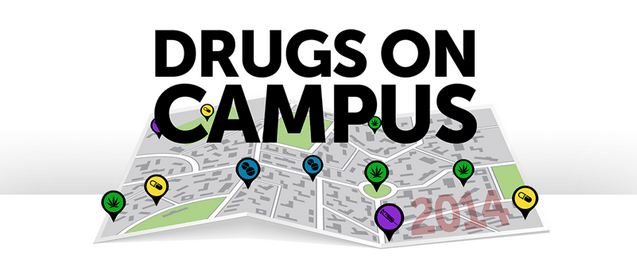
To investigate the prevalence of drug and alcohol culture across U.S. college towns, our data journalists used public records to analyze arrest data and disciplinary actions. The Drugs on Campus project relied on a computer-assisted reporting workflow to process and clean large datasets from various sources.
The result? A series of interactive maps that visualize where these incidents occurred most often, turning raw records into an accessible and impactful infographic.
Social Shares: 8,535
Featured In: The Huffington Post (HuffPost), Chicago Sun Times, DrugFree.org, TimesUnion.com
Why It Works: This campaign highlights the power of a single dataset when approached creatively. By updating and expanding the methodology over time, our newsroom produced a three-part series that kept the topic relevant and newsworthy — a classic use case for ongoing data-driven journalism.
Instagram Overshare: Celebrity Posts and Risky Behavior
Our data team analyzed hundreds of celebrity Instagram accounts to determine who shares the most content and who frequently posts photos involving drugs or alcohol. We scraped and categorized thousands of images using a custom dashboard and automated data analysis workflow.
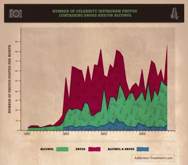
By pairing data science with visual storytelling, we presented our findings through infographics and graphs that spotlighted the relationship between fame, influence, and risky online behavior.
Social Shares: 15,810
Featured In: Business Insider, New York Post, Jezebel, MSN, Refinery29, Daily Dot
Why It Works: The use of timely social media data and celebrity culture made this campaign ideal for mass appeal. It also raised broader public interest concerns about misinformation and the normalization of dangerous behaviors — a growing focus in investigative journalism and digital ethics.
Tweet Mapping: What Americans Talk About Most, State by State
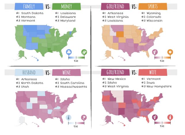
To explore regional cultural trends, we analyzed more than 300,000 tweets containing 30 everyday terms, like church, beer, and school, and used Python and Excel to organize the data by geography.
The result was a set of compelling visualizations showing which terms were most common in each state. We even created interactive “matchups,” such as wine vs. husband or beer vs. sex, to see how conversations varied nationwide.
Social Shares: 4,322
Featured In: Mashable, AV Club, Daily Dot, Bustle, Pixable
Why It Works: This is a great example of how a good data source and strong data skills, paired with compelling visualization formats, can create buzz. Our approach blended data-driven journalism with entertainment value, producing content that sparked curiosity and was widely shared across social media.
What Makes Good Data Journalism?
The best data journalism blends in-depth research with strong storytelling, relying on rigorous methodology and the right tools. Whether we’re analyzing climate change data, reviewing government spreadsheets, or building dashboards with open source programming languages like Python or HTML, we always start with one goal: producing high-quality, data-driven stories that serve the public interest.
Key components of effective data journalism include:
- Strong data sources. From open data portals to social media feeds, government archives, or public records, reliable datasets are essential for good data journalism.
- Technical skills. Our data journalists leverage programming languages, Excel, and platforms like Tableau or Datawrapper to clean and visualize data efficiently.
- Visual storytelling. Infographics, graphs, interactive maps, and dashboards bring clarity to complex datasets, helping audiences quickly grasp important insights.
- Ethical methodology. Every story must uphold transparency, fairness, and accuracy. We follow best practices outlined in the Data Journalism Handbook, Datajournalism.com, and examples from leaders like ProPublica, The New York Times, and The Guardian.
- Audience understanding. Good data journalism simplifies complex issues for non-technical readers without oversimplifying or misleading.
A Brief History of Data Journalism
While data storytelling has existed for decades, the rise of modern data journalism began with projects like The Guardian’s Datablog in 2009 and ProPublica’s investigative dashboards. The Panama Papers, released in 2016, marked a turning point, showing how global collaboration and open source tools could expose systemic corruption.
Today, nearly every major newsroom, from The New York Times to Bloomberg, has a dedicated data team, underscoring the importance of analyzing data and turning it into impactful news stories.
Tools of the Trade: A Data Journalism Toolbox
Modern data journalists rely on a growing set of tools and platforms to manage complex datasets and craft compelling content. Some of the most essential include:
- Programming languages. Python, R, SQL, and JavaScript are used to analyze data and build interactive features.
- Spreadsheets. Excel and Google Sheets allow easy sorting and filtering, as well as calculation of derivative figures.
- Visualization tools. Tableau, Flourish, Datawrapper, and D3.js produce excellent graphs and charts.
- CMS-integrated dashboards. Displaying live datasets and interactivity is key to extracting insights.
- Open source libraries. Pandas, Matplotlib, and Plotly help clean data and offer visualization.
- Content formats. Infographics, data visualizations, interactive maps, and searchable databases are common ways to display data for public use.
These tools allow data teams to move from raw data to storytelling-ready formats quickly, improving newsroom efficiency and audience engagement.
Want to Create Data-Driven Content That Performs?
Fractl’s team of data journalists, designers, and strategists can help you turn complex datasets into meaningful content that drives links, shares, and authority. Whether it’s investigative reporting, interactive dashboards, or newsroom-ready content formats, we know how to use data to tell stories that resonate.
Explore our full collection of case studies to see how data journalism fuels organic growth. Contact us to learn how we can build your next high-performing campaign.